The emphasis so far in this section has been on considering your audience when composing the systems proposal. Tables and graphs as well as words are important in capturing and communicating the basics of the proposed system. Good design should never be underestimated.
Integrating figures into your proposal helps demonstrate that you are responsive to the different ways people absorb information. Figures in the report supplement written information and must always be interpreted in words; they should never stand alone.
Effective use of Tables
Although tables are technically not visual aids, they provide a different way of grouping and presenting analyzed data that the analyst wants to communicate to the proposal reader.
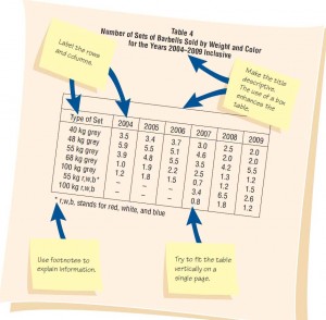
Tables use labeled columns and rows to present statistical or alphabetical data in an organized way. Each table must be numbered according to the order in which it appears in the proposal and should be meaningfully titled. Figure below shows the appropriate layout and labeling for a table.

Some guidelines for tables are the following:
- Integrate tables into the body of the proposal. Don’t relegate them to the appendices.
- Try to fit the entire table vertically on a single page if possible.
- Number and title the table at the top of the page. Make the title descriptive and meaningful.
- Label each row and column. Use more than one line for a title if necessary.
- Use a boxed table if room permits. Vertically ruled columns will enhance the readability.
- Use footnotes if necessary to explain detailed information contained in the table.
Several methods for comparing costs and benefits were presented in previous sections. Tabled results of those comparisons should appear in the systems proposal. If a break-even analysis is done, a table illustrating results of the analysis should be included. Payback can be shown in tables that serve as additional support for graphs. A short table comparing computer systems or options might also be included in the systems proposal.
Effective use of Graphs
There are many different kinds of graphs: line graphs, column graphs, bar charts, and pie charts to name a few. Line graphs, column graphs, and bar charts
compare variables, whereas pie charts and area charts illustrate the composition of 100 percent of an entity.
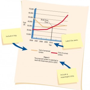
The guidelines for including effective graphs in a proposal (see figure below) are as follows:
- Choose a style of graph that communicates your intended meaning well.
- Integrate the graph into the body of the proposal.
- Give the graph a sequential figure number and a meaningful title.
- Label each axis and any lines, columns, bars, or pieces of the pie on the graph.
- Include a key to indicate differently colored lines, shaded bars, or crosshatched areas.

Much of the detail that goes into a systems proposal is obtained from interviewing, providing questionnaires, sampling, discovering other hard data, and by observation. These topics are discussed in the next two chapters.
Contents
- Project Initiation
- Defining the Problem in Project Initiation
- Selection of Projects
- Feasibility Study – Determining Whether the Project is Feasible
- Technical Feasibility – Ascertaining Hardware and Software Needs
- Acquisition of Computer Equipment – Technical Feasibility
- Software Evaluation in Technical Feasibility
- Economic Feasibility – Identifying & Forecasting Costs & Benefits
- Comparing Costs and Benefits – Economic Feasibilty
- Activity Planning and Control – Project Management
- Using PERT Diagrams in Project Planning
- Managing the Project
- Managing Analysis and Design Activities
- Creating the Project Charter & Avoiding Project Failures
- Organizing the Systems Proposal
- Using Figures for Effective Communication in System Proposal
