Usability is a term that is defined differently depending on which branch of science you are investigating. For our purposes in exploring usability through an HCI lens, we will try to focus on usability as a way for designers to evaluate the systems and interfaces they create with an eye toward addressing as many HCI concerns as we can as thoroughly as possible. Usability studies (according to www.nngroup.com/) are all about finding out what works in the world and what doesn’t. The ISO has created usability standards that you can explore on www.usabilitynet.org/tools/r_international.htm. The standards cover the use of the product (effectiveness, efficiency, and satisfaction in a particular context of use), the user interface and interaction, the process used to develop the product, and the capability of an organization to apply user-centered design.
Nielsen and Mack (1994) and Nielsen, Molich, Snyder, and Farrell (2001) have published usability heuristics (or rules of thumb) based on thousands of usability tests of interfaces and, later, tests of ecommerce Web sites. They include visibility of system status, match between the system and the real world, user control and freedom, consistency and standards, error prevention, reconnection rather than recall, flexibility and efficiency of use, aesthetic and minimalist design, help that users recognize, diagnosis and recovery from errors, and help and documentation. Some of these are already familiar to you from the input and output design chapters.
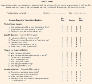
Figure illustrated below shows a usability survey to administer directly to users who have personally interacted with a prototype. It asks users outright about some important usability and ergonomic dimensions. Another approach is to write up use case scenarios for the system. These are helpful in examining usability concerns.
Designing for the Cognitive Styles of Individual Users
One important consideration is that data, particularly data used for decision making, are made available in different forms so that users with different cognitive abilities can make sense of them. Some users may prefer to examine tables and make decisions, some prefer graphs, and others want to read narrative text.
It is also imaginable that the same person wants different types of presentations at different times. For example, suppose a manager wants to compare inventory held at different stores in a region. A graph can present the data very effectively. A column chart can use colors to show when a store is near its stockout level, and it can also show the relative amount of stock by allowing the user to visually compare the height of the bars directly.
Suppose now that the same decision maker wants information about a particular store in a given month. The graphical depiction may have been set up to show the stores from highest to lowest inventory on a month-by-month basis. The user may prefer to return to the table that lists stores alphabetically, with the months listed chronologically. As you can see, the same person may want to see the same data in very different ways.
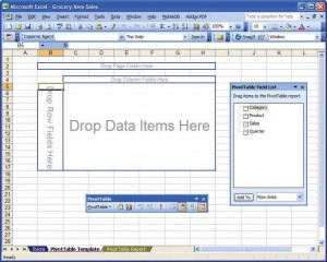
Pivot tables allow users to arrange data in a table in any way they choose. An example of a pivot table template created in Microsoft Excel is shown in the figure below. The user would take an item from the pop-up box called “Pivot Table Field List,” such as Product, drag it over to the table template, and drop it in one of the blank areas. In this example, the user drags and drops Product into the area on the left entitled “Drop Row Fields Here.” The user drops Sales into the largest area that says “Drop Data Items Here.”
Finally the user takes the item called Quarter and drops it into the area called “Drop Column Fields Here.” The result is a table that shows each of the products in alphabetical order and its sales for each of the four quarters we have data for, followed by the grand total for the year. This table is shown in the figure below.
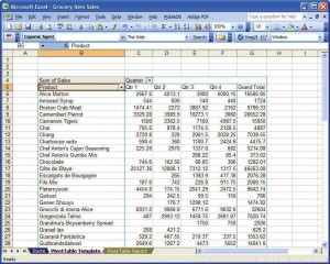
Of course, the user could have done the opposite, that is, drag the item Quarter to the leftmost column and the Product to the area that says “Drop Column Fields Here.” That operation, however, would have produced a table with many columns (one for each product) and only five rows (one for each quarter plus a row for the total). The resulting table would have been difficult to read.
Many different tables are possible just by rearranging these four variables. If the user dragged the variable Category over to the area that says “Drop Column Fields Here,” the columns would have been categories of products, rather than the quarters, and the resulting table would have clearly shown which of the items belonged in each category and produced subtotals for each category. If Category was dragged to the area at the very top of the template that says “Drop Page Fields Here,” then each category would have its own table beginning on a separate page.
Pivot tables are useful because they grant users greater control over how they look at data in different ways within a table. We can examine this same concept for graphs in the next section.
Innovative visual displays of data have existed for quite some time, even as early as the eighteenth century. Barriers to widespread use of visual displays included lack of imagination, the inability to draw graphs and charts in a cost-effective manner, and a lack of appreciation for such displays. The consumer of information must be able to interpret the information in the diagram or it adds little value.
Software that enables the user to visually examine a database or spreadsheet is available. One example is Tableau Software’s product (www.tableausoftware.com). Using an approach similar to the pivot tables we saw in Microsoft Excel, Tableau allows the user to drag and drop variables onto either a row or a column, and they appear on a graph. In the figure illustrated below, the Region and Weekday were designated as columns and the SUM (Sales Total) was designated as a row. Each Product Category was then graphed (with “furniture” in blue, “office supplies” in orange, and “technology” in green).
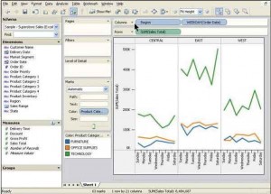
The graph demonstrates that technology sales were higher than the other categories, but in particular technology sales were much higher than either furniture or office supplies in the East. The user was easily able to see this because the Region was singled out as one of the separators by dragging it to the area as a column.
Tableau is a well-designed software package because it goes much further than other applications in extending user capabilities to perform their tasks through the use of pivot table techniques. The developers also realized that users might want to cluster the data into what they consider a meaningful group. Users may then continue analysis by examining one of the groups further.
Figure shown below examines the SUM (Gross Profit) from each Product Category from our example. This graph uses color to indicate a profit (green) or a loss (red). In fact, the intensity of the color indicates the amount of profit or loss.

This graph can be used to explore the situation more deeply by selecting the three clusters of circles that are bright red, isolating them, and then looking at the data for those observations in more detail. Users can examine graphs or simply look at the observations in a table. Once again, they have control over how the information is presented and thus control their task for best cognitive fit.
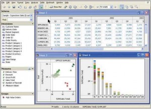
Another example from Tableau, presented in the figure illustration below, shows that this software can also create a dashboard (explained in Chapter “Designing Effective Output“). Here a table, a scatter plot, and a column chart are all shown on the same page. Visual analysis tools like this support visual thinking and extend the user’s cognitive capabilities to do so. An appropriate visual display will increase the chances of making an appropriate decision.
