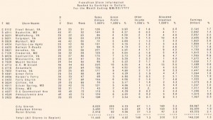
Figure shown below is an output report that is intended for divisional managers of a food wholesaler that supplies a number of franchise grocery stores. We will focus on different aspects of the report as we cover the tools, conventions, and functional and stylistic design attributes of printed output reports.
Report Design Conventions
Conventions to follow when designing a form include the type of data (alphabetic, special, or numeric) that will appear in each position, showing the size of the form being prepared, and showing the way to indicate a continuation of data on consecutive layout forms. Most form design software that analysts now use features standard conventions for designing forms onscreen. In addition, it features familiar drag-and-drop interfaces that allow you to select attributes such as an address block with a mouse click and then drop it on the screen where you want to position it on your form. You will be using WYSIWYG (what you see is what you get) so it makes the design of forms a very visual exercise.

Constant information is information that remains the same whenever the report is printed. The title of the report and all the column headings are written as constant information. Variable information is information that can vary each time the report is printed out. In our example, the sales figures in thousands of dollars will change; hence, they are indicated as variable information.
Paper Quality, Type, and Size
Output can be printed on innumerable kinds of paper. The overriding constraint is usually cost. One example is the use of security paper for checks and check envelopes, as well as for documents that must bear official, inalterable seals or holograms, such as passports.
Preprinted forms can easily convey a distinctive corporate image through the use of corporate colors, logos, and other design elements. Using innovative shapes, colors, and layouts is also a dramatic way of drawing users’ attention to the report contained on the preprinted form.
Design Considerations
In designing the printed report, the systems analyst works with users to incorporate both functional and stylistic or aesthetic considerations so that the report supplies the user with necessary information in a readable and pleasing format. Because function and form reinforce each other, one should not be emphasized at the expense of the other.
Functional Attributes The functional attributes of a printed report include (1) the heading or title of the report, (2) the page number, (3) the date of preparation, (4) the column headings, (5) the grouping of related data items together, and (6) the use of control breaks. Each of these serves a distinctive purpose for the user.
There are several stylistic or aesthetic considerations for the systems analyst to observe when designing a printed report. If printed output is unappealing and difficult to read, it will not be used effectively or may not be used at all. The upshot is uninformed decision makers and a waste of organizational resources.
Printed reports should be well organized, reflecting the way that the eye sees. In this culture, that means that the report should read from top to bottom and left to right. Related data items should be grouped together. The aesthetics of Web site and Web page design are covered in an upcoming section of this chapter.
