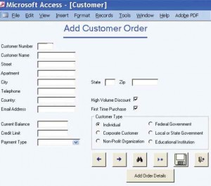
A graphical user interface (GUI, pronounced as “gooey” or “gee-you-eye”)) is the way that users interface with the Windows and Macintosh operating systems. This is also referred to as a point-and-click interface. Users can use a mouse to click on an object and drag it into position. Graphical user interfaces take advantage of additional features in display design such as text boxes, check boxes, option buttons, list and drop-down list boxes, sliders and spin buttons, tab control dialog boxes, and image maps. Figure illustrated below is a Microsoft Access input display showing a variety of GUI controls.

TEXT BOXES. A rectangle represents a text box, as mentioned previously, and is used to outline data entry and display fields. Care must be taken to ensure that the text box is large enough to accommodate all the characters that must be entered. Each text box should have a caption to the left, identifying what is to be entered or what is displayed in the box. In Microsoft Access, character data are aligned on the left, and numeric data are aligned on the right.
CHECK BOXES. In the GUI controls example, a check box is used to indicate a new customer. Check boxes contain an X or are empty, corresponding to whether or not the user selected the option; they are used for nonexclusive choices in which one or more of the options may be checked. An alternative notation is to use a square button with a check mark (✓) to indicate that the option has been selected. Note that check box text, or label, is usually placed to the right of the box. If there is more than one check box, the labels should have some order to them, either alphabetic or with the most commonly checked item appearing first in a list. If there are more than 10 check boxes, group them together in a bordered box.
OPTION BUTTONS. A circle, called an option button or a radio button, is used to select exclusive choices. Only one of several options can be chosen. In this way you can make it clear to users that they must decide among options. Choices are again listed to the right of the button, usually in some sequence. If there is a commonly selected option, it is usually selected as a default when the page first displays. Often there is a rectangle, called an option group, surrounding the radio buttons. If there are more than six option buttons, consider using a list box or a drop-down list box.
LIST AND DROP-DOWN LIST BOXES. A list box displays several options that may be selected with the mouse. A drop-down list box is used when there is little room available on the page. A single rectangle with an arrow points down toward a line located on the right side of the rectangle. Selecting this arrow causes a list box to be displayed. Once a user makes a choice, it is displayed in the drop-down selection rectangle and the list box disappears. If there is a commonly selected choice, it is usually displayed in the drop-down list by default.
TAB CONTROL DIALOG BOXES. Tab control dialog boxes are another part of graphical user interfaces and another way to get users organized and into system material efficiently. In designing tab control boxes, create a separate tab for each unique feature, place the most commonly used tabs in front and display them first, and include buttons for OK, Cancel, and Help.
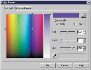
SLIDERS AND SPIN BUTTONS. Sliders and spin buttons are used to change data that have a continuous range of values, giving users more control when choosing values. Moving the slider in one direction or the other (either left/right or up/down) increases or decreases the values. Figure below illustrates the use of sliders to change the amount of red, green, and blue when selecting a new color. Spin buttons are also used to change a continuous value and are shown to the right of the sliders.

IMAGE MAPS. Image map fields are used to select values within an image. The user clicks on a point within an image and the corresponding x- and y-coordinates are sent to the program. Image maps are used when creating Web pages containing maps with instructions to click in a certain area in order to view a detailed map of the region.
TEXT AREAS. A text area is used for entering a larger amount of text. These areas include a number of rows, columns, and scroll bars that allow the user to enter and view text greater than the size of the box area. There are two ways to handle this text. One is to avoid the use of word wrap, forcing the user to press the Enter key to move to the next line; the text will scroll to the right if it exceeds the width of the text area. The other option is to allow word wrap.
MESSAGE BOXES. Message boxes are used to warn users and provide other feedback messages in a dialog box, often overlapping the display. These message boxes have different formats. Each should appear in a rectangular window and should clearly spell out the message so that the user knows precisely what is happening and what actions are possible.
COMMAND BUTTONS. A command button performs an action when the user selects it with the mouse. Calculate Total, Add Order, and OK are all examples. The text is centered inside the button, which has a rectangular shape. If there is a default action, the text is surrounded with a dashed line. The button may also be shaded to indicate that it is the default. Users press the Enter key to select the default button.
