The systems analyst should be capable of designing a complete and useful form. Unnecessary forms that waste an organization’s resources should be eliminated.
Forms are important instruments for steering the course of work. They are preprinted papers that require people to fill in responses in a standardized way. Forms elicit and capture information required by organizational members that will often be input to the computer. Through this process, forms often serve as source documents for users or for input to ecommerce applications that humans must enter.
To design forms that people find useful, four guidelines for form design should be observed:
- Make forms easy to fill in.
- Ensure that forms meet the purpose for which they are designed.
- Design forms to ensure accurate completion.
- Keep forms attractive.
Each of the four guidelines is considered separately in the following sections.
Making Forms Easy to Fill In
To reduce error, speed completion, and facilitate the entry of data, it is essential that forms be easy to fill in. The cost of the forms is minimal compared with the cost of the time employees spend filling them in and then entering data into the information system. It is often possible to eliminate the process of transcribing data that are entered on a form into the system by using electronic submission.
That method often features data keyed in by users themselves, who visit Web sites set up for informational or ecommerce transactions.
FORM FLOW. Designing a form with proper flow can minimize the time and effort expended by employees in form completion. Forms should flow from left to right and top to bottom. Illogical flow takes extra time and is frustrating. A form that requires people to go directly to the bottom of the form and then skip back up to the top for completion exhibits poor flow.
SEVEN SECTIONS OF A FORM. A second method that makes it easy for people to fill out forms correctly is logical grouping of information. The seven main sections of a form are the following:
- Heading.
- Identification and access.
- Instructions.
- Body.
- Signature and verification.
- Totals.
- Comments.
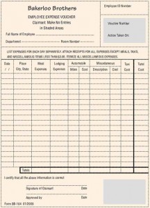
Ideally, these sections should appear on a page grouped as they are on the Bakerloo Brothers Employee Expense Voucher in the figure shown below. Notice that the seven sections cover the basic information required on most forms. The top quarter of the form is devoted to three sections: the heading, the identification and access section, and the instructions section.

The heading section usually includes the name and address of the business originating the form. The identification and access section includes codes that may be used to file the report and gain access to it at a later date. (In Chapter “Designing Databases”, we will discuss in detail how to access specially keyed information in a database.) This information is very important when an organization is required to keep the document for a specified number of years. The instructions section tells how the form should be filled out and where it should be routed when complete.
The middle of the form is its body, which composes approximately half of the form. This part of the form requires the most detail and development from the person completing it. The body is the part of the form most likely to contain explicit, variable data.
The bottom quarter of the form is composed of three sections: signature and verification, totals, and comments. Requiring ending totals and a summary of comments is a logical way to provide closure for the person filling out the form.
There is one more feature to notice about the Bakerloo Brothers form. The form design provides an internal double check, with column totals and row totals expected to add up to the same number. If the row and column totals don’t add up to the same number, the employee filling out the form knows there is a problem and can correct it on the spot. An error is prevented, and the employee can be reimbursed the amount due; both outcomes are attributable to a suitable form design.
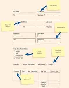
CAPTIONING. Clear captioning is another technique that can make easy work of filling out a form. Captions tell the person completing the form what to put in a blank line, space, or box. Several options for captioning are shown in the figure below. Two types of line captions, two types of checkoff captions, and examples of a boxed caption and table caption are shown.

The advantage of putting the caption below the line is that there is more room on the line itself for data. The disadvantage is that it is sometimes unclear which line is associated with the caption: the line above or below the caption.
Line captions can be to the left of blanks and on the same line, or they can be printed below the line on which data will be entered.
Another way to caption is to provide a box for data instead of a line. Captions can be placed inside, above, or below the box. Boxes on forms help people enter data in the correct place, and they also make reading the form easier for the form’s recipient. The caption should use a small type size so that it does not dominate the entry area. Small vertical tick marks may be included in the box if the data is intended for entry into a computer system. If there is not enough room on a record for the data, the person filling out the form, rather than the data entry operator, has the freedom to determine how the data should be abbreviated. Captions may also include small clarification notes to help the user correctly enter the information, such as Date (MM/DD/YYYY) or Name (Last, First, Middle Initial).
Whatever styles of line caption are chosen, it is important to employ them consistently. For instance, it is confusing to fill out a form that has both above and below-line captions. Check-off captions are superior when response options are necessarily restricted. Notice the list of travel methods shown for the vertical check-off example in the previous figure. If employee expenses for business travel are reimbursed only for those travel methods listed, a check-off system is more expedient than a blank line. This method has the added advantage of reminding the person who is verifying the data to look for an airline ticket stub or other receipt.
A horizontal check-off caption is also superior to a line caption when information required is routine and constant. An example is a form that would request services from one of the following departments: Photo Lab, Printing Department, Maintenance, or Supplies. The departments routinely provide services to others in the organization and are not likely to change quickly.
Table captions work well in the body of a form on which details are required. When an employee properly fills out a form with table captions, he or she is creating a table for the next person receiving the form, thereby helping to organize data coherently.
A combination of captions can also be used effectively. For example, table captions can be used to specify categories such as quantity, and line captions can be used to indicate where the subtotal, sales tax, and total should be. Because different captions serve different purposes, it is generally necessary to employ several caption styles in each form.
Meeting the Intended Purpose
Forms are created to serve one or more purposes in the recording, processing, storing, and retrieving of information for businesses. Sometimes it is desirable to provide different information to different departments or users but still share some basic information. This situation is where specialty forms are useful.
The term specialty form can also refer solely to the way forms are prepared by the stationer. Examples of stationers’ specialty forms are multiple-part forms that are used to create instant triplicates of data, continuous-feed forms that run through the printer without intervention, and perforated forms that leave a stub behind as a record when they are separated.
Ensuring Accurate Completion
Error rates typically associated with collecting data will drop sharply when forms are designed to ensure accurate completion. Design is important for ensuring that people do the right thing with the form whenever they use it. When service employees such as meter readers or inventory takers use handheld devices to scan or otherwise key in data at the appropriate site, the extra step of transcription during data entry is avoided. Handheld devices use wireless transmission, or are plugged back into larger computer systems so they can upload the data that the service worker has stored. No further transcription of what has occurred in the field is necessary.
Keeping Forms Attractive
Although attractiveness of forms is dealt with last, its order of appearance is not meant to diminish its importance. Rather, it is addressed last because making forms appealing is accomplished by applying the techniques discussed in the preceding sections. Aesthetic forms draw people into them and encourage completion.
Forms should look uncluttered. To be attractive, forms should elicit information in the expected order: convention dictates asking for name, street address, city, state, and zip or postal code (and country, if necessary). Proper layout and flow contribute to a form’s attractiveness. Using different type fonts in the same form can help make it appealing for users to fill in. Separating categories and subcategories with thick and thin lines can also encourage interest in the form. Type fonts and line weights are useful design elements for capturing attention and making people feel secure that they are filling in the form correctly.
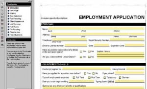
Forms design packages are available for PCs. Figure illustration below shows how forms can be created using software that allows the analyst to automate quickly business processes for which paper forms are already in existence. The analyst can use a set of tools to set up fields, check boxes, lines, boxes, and many other features. Paper forms can also be scanned in and then published to the Web.

Controlling Business Forms
Controlling business forms is an important task. Businesses often have a forms specialist who controls forms, but sometimes this job falls to the systems analyst, who sets up and implements forms control.
The basic duties for controlling forms include making sure that each form in use fulfills its specific purpose in helping workers accomplish their tasks and that the specified purpose is integral to organizational functioning, preventing duplication of the information that is collected and of the forms that collect it, designing effective forms, deciding on how to reproduce forms in the most economical way, and establishing procedures that make forms available (when needed) at the lowest possible cost. Often this entails making forms available on the Web for printing out. A unique form number and revision date (month/year) should be included on each form, regardless of whether it is completed and submitted manually or electronically. This helps users be organized and efficient.
