Chapter 12 covers designing displays for human or computer input, and the same guidelines also apply here for designing output, although the contents will change. Notice that output for displays differs from printed output in a number of ways. It is ephemeral (that is, a display is not permanent in the same way that printouts are), it can be more specifically targeted to the user, it is available on a more flexible schedule, it is not portable in the same way, and sometimes it can be changed through direct interaction.
In addition, users must be instructed on which keys to press, links to click, or how to scroll when they want to continue reading additional displays, when they want to know how to end the display, and when they want to know how to interact with the display (if possible). User access to displays may be controlled through a password, whereas distribution of printed output is controlled by other means.
Guidelines for Display Design
Four guidelines facilitate the design of displays:
- Keep the display simple.
- Keep the presentation consistent.
- Facilitate user movement among displayed output.
- Create an attractive and pleasing display.
Just as with printed output, good displays are not created in isolation. Systems analysts need the feedback of users to design worthwhile displays. Once approved by users after successive prototypes and refinements, the display layout can be finalized.
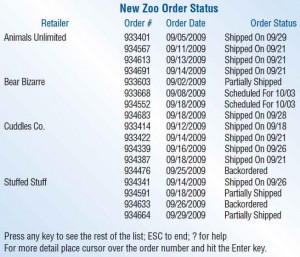
The output produced from the design display is pictured in the figure below. Notice that it is uncluttered, but it still gives a basic summary of the shipping status. The display orients users as to what they are looking at with the use of a heading. Instructions at the bottom of the display provide users with several options, including continuing the present display, ending the display, getting help, or getting more detail. This display provides context for users attempting to complete a task such as checking on the status of an order.

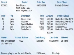
Output displays in an application should show information consistently from page to page. Figure illustration below shows the display that results when the user positions the cursor over the order number for a particular retailer. The new display presents more details on Bear Bizarre. In the body of the display, the user can see the retailer’s order number, complete address, the order date, and the status. In addition, a detailed breakdown of the shipment and a detailed status of each part of the shipment are given. A contact name and phone number are supplied, along with the account balance, credit rating, and shipment history. Notice that the bottom portion of the display advises the user of options, including more details, ending the display, or getting help. Users are provided control over what they might do next while viewing the display.

Rather than crowding all retailer information onto one page, the analyst has made it possible for the user to bring up a particular retailer if a problem or question arises. If, for example, the summary indicates that an order was only partially shipped, the user can check further on the order by calling up a detailed retailer display and then following up with appropriate action.
Using Graphical Output in Screen Design
Graphical output can be powerful. It is much easier to identify a trend or notice a pattern when the right graph is displayed. Most people notice differences in graphs more easily than they notice differences in tables. It is important to collaborate with users in choosing the correct style of graph to communicate your meaning.
As with the presentation of tabular output, graphical output needs to be accurate and easy to understand and use if it is to be effective in communicating information to users. Decision makers using the graphs need to know the assumptions (biases) under which the graphs are being constructed so that they can adjust to or compensate for them.
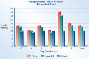
In designing graphical output, the systems analyst and any users involved in design prototyping must determine (1) the purpose of the graph, (2) the kind of data that need to be displayed, (3) its audience, and (4) the effects on the audience of different kinds of graphical output. In the instance of a decision support system, the purposes of graphical displays are to support any of the three phases of problem solving a user experiences: intelligence, design, or choice. An example from the Nebraska State Patrol workforce planning DSS is shown in the figure below. Here, current response times, forecasted response times, and minimum requirements are graphed as differently shaded bars.

Dashboards
Decision makers need output that helps them make decisions effectively and quickly. It helps executives and other decision makers if all the information they need to make decisions is displayed in front of them. When given a written report, a decision maker would prefer all the information to be contained in that one report rather than searching for information in other places. The same principle applies to screen design.
A dashboard, similar to the dashboard in a car, has many different gauges. Each gauge can display a graph (similar to the speed in miles or kilometers per hour), a problem light (similar to a light showing that the automatic braking system is not functioning), or even text (like an odometer that simply counts the miles traveled).
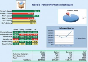
An executive can find a dashboard to be extremely useful in making decisions, but only if the dashboard is designed properly. The dashboard illustrated below shows that a considerable amount of information can be included on a single screen.

Dashboards are all about communicating measurements to the user. An executive uses a dashboard to review performance measures and to take action if the information on the screen calls for it. Here are some rules of thumb that can be used to make the dashboard you design more attractive and more effective:
- Make sure the data have context. If you design a screen stating that sales last month were $851,235, what does that mean? Are sales above or below average?
- Display the proper amount of summarization and precision. It will clutter the screen if you display last month’s sales as $851,235.32 instead of $851,235 or even $851K.
- Choose appropriate performance measures for display. For example, plotting the difference in actual versus expected sales in a deviation chart is much more meaningful than using a line chart to plot actual and expected sales.
- Present data fairly. If you introduce bias into the dashboard, it will hinder rather than support good decisions.
- Choose the correct style of graph or chart for display. Using the correct chart is important. While a pie chart may be an excellent graph to persuade someone, it may not be a good way for an executive to monitor the performance of regional offices, for example.
- Use well-designed display media. Even if you choose the very best type of graph, you still need to draw, size, color, and label the graph in a meaningful and pleasing way.
- Limit the variety of item types. Keep the number of graph, chart, and table styles to a minimum so that the information can be communicated quickly and accurately.
- Highlight important data. Use bright colors and bold fonts only for important data. You can highlight key performance measures or important exceptions that are occurring but not both. Choose what to emphasize.
- Arrange the data in meaningful groups. Performance measures are almost always associated with other performance measures because of the data displayed or the type of graph. Learn how to group associated items together.
- Keep the screen uncluttered. Avoid photographs, ornate logos, or themes that can distract users from the data.
- Keep the entire dashboard on a single screen. All the performance measures are meant to be on the same screen. If forced to switch screens, a user will not see two relevant measures at the same time.
- Allow flexibility. If an executive wants a different graph or chart, consider replacing it. Prototyping the dashboard and refining it based on the user’s feedback makes sense. Decision makers often know best when it comes to getting the right information in the most appropriate form for their decision style.
Widgets and Gadgets—Changing the Desktop Metaphor
Related to dashboards are new, user-designed desktops. Systems designers who develop software for personal computers should be aware of a trend to encourage users to personalize their desktops with widgets and gadgets. These items are small programs, usually written in JavaScript and VBScript, that reside either in a sidebar attached to a browser or program or even reside in a special layer on the desktop itself.
Widgets (as they are called by Yahoo!), Dashboard Widgets (as they are called by Apple), and Gadgets (as they are called by Google and Microsoft) can be any type of program that may be useful to anyone interacting with a computer. Clocks, calculators, bookmark helpers, translators, search engines, easy access to utilities, quick launch panels, and sticky notes are popular productivity widgets.
Stock tickers, weather reports, and RSS feeds are also useful widgets. Gadgets allow users to track packages and check schedules. The user can put amusements like games, music podcasts, and hobbies on their desktop as well. Widgets and gadgets possess dual, almost paradoxical natures. They can empower users to take part in the design of their own desktop, and designers who are observant can learn a lot about what users prefer when they study user-designed desktops. But widgets and gadgets can also distract people from system-supported tasks. Designers need to work with users to support them in achieving a balance. One possibility is to add user-specific performance measures as widgets and gadgets that are helpful to decision makers.
